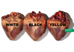
If anyone ever needs an image to define the word “taboo” or “controversy, I think this would be it.

This ad begins to apply cultural or religious rhetoric that evokes issues of values, judgments and secondary stories.

I am not Christian or involved in any type of church so I might not fully understand the religious implications of this ad but I do know that this would make people upset.


As far as ad effectiveness goes, I think Benetton might have pissed more people off with this ad then even they could imagine. I can only fathom the amount of controversy that this ad stirred up, them amount of people that talked about this ad, and United Colors of Benetton. As I have learned in my marketing class, free press is good press, whether its negative or positive. It gets people talking about the company and their product. It ends up that the people who are most upset by these shocking ads give the company the most publicity. It’s a little ironic and maybe unfortunate in some cases, for those companies that really don’t deserve it, but in my opinion I think it’s a great move on Benetton’s part.

I don’t think this ad really helps their image as far as corporate rhetoric goes, or rather if it does than I think the point may be lost on a large part of their audience.

It’s important to remember who sees these ads and where they see these ads. As there are no United Colors of Benetton stores in New Mexico (I think the closest store is in Houston, TX), they have no priorities to market in this state, and which is why many people probably haven’t seen these ads in real life (maybe only in a book or somewhere on the internet as a reference for something else). What’s odd to me is that I used to live in Houston and in India (where they also have stores) and I never saw any advertising for the store, I did however see these ads in New York City. They use the huge billboards and blow these images up to monstrous proportions so they can be seen from miles away (if a building or another billboard doesn’t get in its way!).

I think it’s interesting that Benetton is so picky with the target audience that they market to. As can be seen with this ad of the priest and nun, it’s very important to think about the target audience. In a place like New York City this ad can be taken for what it is, an artistic attempt to bring up taboo social issues. In a place like Houston, with its mega churches like Lakewood Church and devout followers of Joel Osteen (who recently turned the Rockets basketball stadium into his church complete with televised services!), I think this point might be totally lost and possibly cause the store to go out of business in the area. I don’t even want to think about what would happen if this ad was somewhere along I-25 here in Albuquerque! I recently showed this ad in my marketing class and, unsurprisingly, got very few positive responses from my classmates.

All in all I think it’s important for a company to pick a stance and stick to it, unless of course its not working at all, then they might want to consider repositioning. Otherwise it says a lot about the strength and power of a company that can show an ad like this (and this isn’t even the worst!) and still continue to gain market share every year. Benetton is currently Italy’s largest clothing manufacturer and the company is going strong on 42 years of business with no signs of slowing down or backing off. At this point it doesn’t really matter whether I think the ads are effective or not, that fact alone tells the world that Benetton has found a marketing strategy that works for them.

Just a note about my sources… all of the images and information about United Colors of Benetton can be found on their corporate website http://www.benettongroup.com. They have so much information about the company, including financial statements, press releases, company history and their plans for the future on there. Other than that, I have taken information from my English 220 class on Advertising Rhetoric at University of New Mexico. To see lecture notes you can go to, http://english220.wordpress.com/

I have also taken some information from my Marketing Management 322 class also at University of New Mexico, although it was mostly what I have chosen to retain after completing the class, I have not directly quoted my teacher or my notes in this blog.

The rest of the writing is a combination of my thoughts, opinions and experiences and most of all a reflection of what I have learned about advertising rhetoric in my class.

When I look at this image I begin to make social and cultural connections between the image and my brain to figure out what the overall message of the ad is supposed to be. I know I already talked a bit about this in the ad with the girl and the doll but I think this ad deserves a deeper look at this main point. 

I was trying to figure out why this ad makes so much sense, why the message seems so obvious to me when there is really nothing but the image to base my information off of…lemme back up and begin by explaining what I think this ad is about. 


So I know its a United Colors of Benetton ad, because their logo is plastered on the side, but instead of just using an artfully composed image like the girl and her doll, this is more of a poster or ad with a purpose. It’s purpose it to advertise this World Food Programme called “Food for Life.”

I would say with this image, Benetton is not trying to advertise their clothing or even trying to advertise themselves as company that sells anything. I think they are trying to establish their corporate rhetoric, even more so than in their other ads.

I really think they are trying to attract customers and create brand loyalty with customers that have specific social values, which are reflected in this World Food Programme that they are supporting. Maybe a consumer who is already involved in programs like this or who is already part of this socially conscious culture would see this ad and become attracted to United Colors of Benetton because they support the same causes that the consumer does.

I think in many cases companies under estimate their consumers and their capabilities. Benetton’s main competitor in Europe, H&M, has started a campaign that supports AIDS, Gap has been doing the (RED) campaign to support something (I’m still not really sure what they are trying to do) in Africa, but Benetton is one of the only major clothing companies that really follows through with their campaigns. They actually make the campaigns about the issues, and then hope that support for their clothing line will follow. Gap sells these clothes with distinctive logo’s for their RED campaign and supposedly a percentage of the money will go to Africa, but Gap makes sure that they still are making a profit on these clothes and on top of that they hardly have to pay for advertising thanks to celebrities like Oprah and the fact that everyone is walking around with these logos on their shirts. 

With that said I want to talk about the visual aspects of this ad and why it works so well. David Mackenzie Ogilvy talks about print ads in his book Ogilvy on Advertising (1983) and all of these rules that apply to print ads, which I think are a little outdated. I know this hasn’t been talked about in class but I can’t talk about this ad without mentioning cause-related-marketing, which actually was started in 1983 by American Express (http://media.wiley.com/product_data/excerpt/09/04717175/0471717509.pdf). Actually the main part of Ogilvy that doesn’t apply to this ad are his thoughts on ad copy, which he thinks is really important to have in the ad. For this ads purposes the image and headline speaks for itself… there I finally got to my main point! 

The consumer doesn’t need ad copy and extraneous information to distract them, they just need this bracing image to say it all. Going back to the basics of visual rhetoric our minds fill in the gaps between what we see and what is stored in our minds to create a full picture. 

The spoon tells me this man is hungry, his lack of clothing tells me he may not have money and both of these things put together tell me his basic human needs aren’t being met, according to Maslow’s Hierarchy of Needs, which states that physiological needs such as food, water, sleep, breathing and shelter are the first needs that must be met (A.H. Maslov, A Theory of Human Motivation, Psychological Review 50 (1943):370-96.).

The fact that the spoon is attached to his hand, and is actually in place of his hand, tells me that this eating utensil is more valuable to him than his hand at this point. 

The title, “Food for life,” brings up an important idea that is scarcely mentioned in American culture, the theory of eating to live rather than living to eat.

While I, as a consumer, might rather blindly buy products and enjoy looking at the eye candy of fashion ads, I, as a person who spent five years going to school in India and has first hand seen the hunger and poverty at its worst, would much rather support a socially conscious company like Benetton. 

I feel like even if I didn’t like their clothes I would still want to buy something from them to support them, which coming from a poor college student is a rare statement! In other words, I think this ad and the theories put into play behind the ad are very effective for me. 

United Colors of Benetton has eliminated their clothing from their advertising campaigns and have been focusing on social issues of global concern since 1982 when Olivero Toscani began working for the company. They have come to rely solely on the visual rhetoric of their ads and the ideas that their images stand for to promote their company and ultimately sell their clothes. (benetton website)

When an advertising company puts out a print ad they have to create an image that can stand on its own without the special effects or sounds of the television. Print ads usually show up on billboards or in magazines where the consumer is being bombarded and effected by a million different visual elements at once, so the image of a ad really needs to stand out and stick in the consumers mind. United Colors of Benetton has gotten the concept of “shock advertising” down to a science. They show images that either revolt consumers, tug at their heart strings, or provoke new ideas of thinking.

This particular ad of a young girl, covered in dirt, practically naked and holding on to a doll, tugs at my heart strings. The first thing I see when I look at this image are those big brown eyes looking directly at me, challenging me and making me feel guilty about the clean clothes I’m wearing and the coffee that I am drinking while I sit in the coffee shop and worry about getting my homework done before I can go ride my bike tonight.

What feelings does this image evoke for you?


I bring all of this up because when we look at an ad we don’t just look at it, but we look through it. In order to figure out what the ad is really about we, as consumers, our brain has to make connections between what we see and our personal experiences and values to complete the message of the ad.

There are no words in this ad, other than United Colors of Benetton logo, in fact, there are no connections to United Colors of Benetton besides for this logo, so the consumer is in complete control of how they interpret the image. The symbols of the image begin to stand in for what the ad really means and what the ad is really trying to promote.

This brings me to the corporate rhetoric of United Colors of Benetton. Every element of this ad stands for what Benetton is trying to promote through their advertising. Luciano Benetton, the founder of Benetton Group (which owns the clothing brands United Colors of Benetton, Under Colors of Benetton, Sisley, Playlife and Killer Loop) says “The purpose of advertising is not to sell more. It’s to do with institutional publicity, whose aim is to communicate the company’s values…we need to convey a single strong image, which can be shared anywhere in the world” (museedelapub.org)

Benetton is one of those few companies that actually practices what they preach. Unlike their competitors such as Gap and H&M, Benetton designs, manufactures, and retails all of their clothing. According to the company’s website, they are currently Italy’s largest clothing manufacturer. They don’t outsource labor to third world countries while Gap and H&M do and have been widely criticized for. This image makes me think about poverty and the cheap child labor that is used in third world countries

This ad is effective on many different levels. While it doesn’t show me the clothing or get me excited about their fashions, I am intrigued by their values and I have formed a respect for the company.


United Colors of Benetton takes shock advertising to a whole new level with this image. This one of Benetton’s ads from 1992 as part of their campaign to confront themes of social nature, including images of “obscure and insidious illness, violence and intimidation, forced emigration, and natural catastrophes” (http://production.investis.com/ben_en/about/campaigns/list/electric_chair/?version=1).

This ad reminds me of Andy Warhol’s “Electric Chair” series of prints from the 60s, which is still gives me shivers.

I am from Texas, a state that has put to death 405 people since 1982 (http://www.tdcj.state.tx.us/stat/executedoffenders.htm), and extremely against the death penalty, so I have a very strong reaction to these images. Just looking at the website with all the names and stats on the people who have been executed gives me goosebumps and my stomach starts to flip.

Before I start to go too far off on a tangent that is completely unrelated to class, let me say that this ad is extremely emotional in it’s subject matter and falls into Wilson’s argument about the Six Tugs of War. As with all of Benetton’s ads since 1982, it doesn’t show any clothing, but chooses to promote issues of social controversy. This is more than a clothing ad, it’s a piece of artwork created to make the viewer think about this issue. Of course, the brand name is smacked on the side of the photo to create a connection between Benetton and the image, otherwise the consumer would have no idea what to attribute or connect to the image. I think Andy Warhol would be very pleased with this image… it takes his ideas of consumerism and the commodification of people and ideas through mass media to the next level by actually implementing these ideas into their advertising techniques.

I think for those very reasons a lot of people have issues with Benetton’s ads and in some cases it’s hard to decide if Benetton is doing this because they really care about these issues or if they are capitalizing on issues. Personally, I think they really care but in the end should it really matter? At least they are bringing these issues to people’s attention unlike Wal-Mart which doesn’t even try to hide their evil ways!

I have decided to change my ad campaign to United Colors of Benetton. I am going to use 4 of their print ads, each from a different one of their campaigns. McCann Erickson is the ad agency that Benetton uses to produce their ads. Each of their campaigns deal with different issues of global concern.

In my last post the ad dealt with racism, in their new campaign, called Microcredit Africa Works, they tackle issues dealing with the economy. Benetton has linked up with the company called Birima which was set up by the singer Youssou N’Dour. This program gives small, low interest loans (micro loans) to farmers and artisans in Senegal. Benetton has given Birima a large amount of money that they loan to the people and in turn Benetton’s logo and name is plastered on all the images. This provides a symbiotic relationship between the two groups, Benetton’s image is boosted and Birima has money for loans, they both win.

In this campaign, Benetton deals with issues of poverty and taking steps to change the ways of the world. This campaign definitely uses emotion to connect with the consumer. Their focus is completely away from their product, yet it makes me want to buy their product. If we had a Benetton store in Albuquerque, I would want to buy something from there, rather than somewhere like Target, just because I know they support causes like this.

This might not be the same use of emotion that Williams talks about in his article on the The Six Tugs of War, but I think it still applies. I also think that because they don’t use their clothes in the campaign they are pretty much completely relying on consumers emotions and curiosity to sell their clothes.

What I really like about the Benetton Group is there website. They have so much information about the actual company on their website, from past ad campaigns to press releases, financial statements, future projections and tons of other information. I like that they aren’t trying to hide anything from the consumer like many companies try to do today. I don’t think that they legally have to put that information on their website because they are not a publicly held corporation but they do.

I love the artistic qualities of the ad, it is so bright and colorful, yet simple and striking. It shows real people and what they do to make a living and I think it has real potential to change the way people look at Africa and it’s a great start to ending poverty.

I think this is more of a music video than a tv commercial but either way, it’s promoting Birima and Benetton’s message about Microcredit Africa Works. I am going to do a wide campaign analysis and stick to print ads but the animation in this video makes me smile so I wanted to share it with you.


I’m getting a little bored with the mac vs. pc ads, so I wanted to look at something different and save the rest of the Apple ads for the ad campaign analysis project.

This week I want to talk about the United Colors of Benetton ad campaign and how they have positioned their advertising to address global controversial issues, rather then their specific products. Many of their ads would be considered “shock advertising,” which have many pros and cons. On one hand, their images and ideas might offend people and make them upset, causing them to want to stay away from the company or brand. On the other hand, it gets people’s attention and makes them think. It challanges the consumer to look outside their comfort zone and beyond the normal realm of advertising. I find United Colors of Benetton’s approach to advertising very interesting and effective. Take a look at this ad from one of their recent campaigns, there is absolutely nothing in the ad that connects the consumer with the clothes that they sell, or even any clothes at all, yet it presents a very strong message.

Instead of using their clothing, they use their company philosophy to entice the consumer. They use a combination of emotion, intellect, and strong visual language, with very minimal ad copy in this ad to attract attention. The message is simple, we are all the same on the inside, regarless of what color we are on the outside. I think this approach is brilliant because it makes the consumer think about the company they want to support, rather than basing their shopping decisions solely on the merchandise that they sell.

In the marketplace today it is vey easy to get caught up in just the products and forget about personal values or ethics. Affordability and convenience are such a huge factor in consumer purchasing that sometimes it is almost impossible to avoid huge corporations like Wal-mart and Target that aren’t the most enviromentally friendly or socially conscious companies. While some consumers don’t care one way or another, I think there is a huge market out there of consumers that DO care about these issues and would love to support socially conscious companies but don’t want to have to go too far out of their way to figure out what’s what. United Colors of Benetton puts their philosophy out there so it’s easily accessible to people and allows them to think about more intellectual issues than just clothing, while at the same time promoting their company.

Here is another ad that I will be using for my ad campaign analysis. It is another mac vs. pc ad that I see as the next part of the mac vs. pc story that mac is trying to tell.

I forgot to mention last week that this campaign has been created for Apple Inc. by TBWA, which is Apple Inc.’s advertising agency. TBWA is a very large advertising agency that has a long client list, including Absolute Vodka, Adidas, Playstation, McDonalds and Infiniti, to name a few. This particular campaign is called the “Get a Mac” campaign and it started in 2002. Apple’s intentions of these ads were to get PC users to switch over to Macs.

The ads are directed by Phil Morrison and are accompanied with music composed my Mark Mothersbaugh called “Having Trouble Sleeping”. Mothersbaugh is well known for his music composed for Wes Anderson films, such as The Royal Tenenbaums, The Life Aquatic with Steve Zizzou, and Rushmore. In addition he has composed music for over 80 other mainstream and independent films.

I know this weeks lecture was on “image and sound” and how they work together, but I am mainly going to focus on sound in light of my research on the composer of the music. In these commercials I think tropes play a large part to their success. Of course the addition of artistic genius and creativity ultimately are what make these commercials enjoyable for me to watch over again, and actually look forward to the next episode of the campaign, these ads might have completely flopped without the use of tropes.

In this ad we see the familiar faces of Mac and PC, played by the same characters we have seen in previous commercials. The only difference is that this ad has added another, unfamiliar character, the body guard. First of all, this ad uses synechdochy by using characters to represent the different computers, which allows the audience to attach human attributes to each computer. In the beginning of the commercial the characters announce “I’m a Mac” and “I’m a PC”, but the body guard doesn’t announce who he is, the audience can gather from previous cultural implications of his clothing and the way he talks that he is probably a body guard.

This ads purpose is to illustrate the problems of the new Windows Vista operating system. Every time the Mac says something the body guard repeats the question and asks “allow” or “deny”. It becomes very irritating and hard to focus on what Mac is saying because of all the interruptions. I think this aspect of the commercial evokes an emotional response, at least in me. Whenever I use PC’s I get so annoyed at all the pop ups and different windows that i have to click “okay” on before I can finally get to the page that I am trying to find. I guess Vista is trying to minimize the amount of pop ups by adding all these security features, that end up being just as, if not more, annoying than pop ups are. In this ad I can identify a past experience and build on it when I see the actors bring it to life.

I have kind of gotten off topic from sound but I did want to comment on the ad agency’s use of Mark Mothersbaugh music in the ad. This is purely an assumption but in any case, I think that many people who are familiar with Wes Anderson films would know who Mark Mothersbaugh is and by that same measure, I think that many people who use Mac computers for their artistic implications and abilities probably have seen a Wes Anderson film and therefore know the music of Mark Mothersbaugh. This might be completely false logic, but regardless, I think Apple chose Mark Mothersbaugh music on purpose and probably for these specific reasons, and I think it is genius on their part. On the other hand, I don’t think many people would know off the bat that these commercials use Mothersbaugh tunes, I looked it up, but it carriers many of the same intentions that his other music uses in the Wes Anderson films. I think it attracts people and appeals to people in this target group that I have been talking about because it might evoke the same feelings that his music would evoke on a film soundtrack, regardless of if they know specifically who made the music.

I have decided to analyze the mac vs. pc ad campaign. I would like to do this as a wide campaign. All the ads I use will be television commercials that are all done in the same format and with the same characters. Usually only one of these ads plays at a time so each time a new one comes out it’s like a new chapter to the story. I think these ads are very clever and being a mac user, I agree with and can relate to mac’s positioning.

This week I will analyze one of the ads from the campaign in terms of sound and what we hear. I think they all use the same sound method’s so I have just picked the first ad that I want to use.

In each of these commercials Mac and PC’s are represented by human characters and these character’s display characteristics or functions of each product. Since the commercials are for Apple, they show the Mac as a young, hip guy while the PC character is an older man in a suit wearing glasses. Usually the PC has some sort of complaint or problem which he discusses with the Mac, expecting the Mac to agree or have similar problems, which isn’t ever the case.

In this particular commercial, the PC has to go in for surgery so he is wearing a hospital gown and explains how he is nervous because of all the procedures that have to be done on him in order to upgrade to the new Vista software.

This commercial relies almost solely on audio to sell the product. There is no fancy cinematography, elaborate set and they don’t even show the product until the very end of the commercial for a few seconds. The viewer has to tune in and pay attention to what the commercial is saying in order to be persuaded by the commercial.

I think it’s really smart that Apple eliminated everything but the actors and the audio, it fits right in with their idea of simplicity and cleanliness and it leaves nothing for the viewer to be distracted by.

Last week I looked at print ad with no body copy so this week I thought it would only be appropriate to look at an ad that is only body copy and no image. I noticed this week in the discussion that a lot of people brought up Ogilvy’s question: “Nobody reads body copy. True or false?” Personally, I think it depends on the ad. Sometimes people read it and sometimes people don’t and that’s about as far I got. Ultimately it comes down to the advertising agency, if they can make an interesting, eye-catching, irresistibly juicy ad, people will read body copy whether they want to or not.

Ogilvy’s opinion on housewives reading body copy for a food ad but not for a cigar ad is not completely untrue but very dated. My opinion is that most people don’t read it, but then I came across this wonderfully clever Penguin ad. Since Penguin is a publishing company I will assume that a potential customer is one who enjoys reading and would therefore greatly appreciate this little story of success. On the other hand, I am not a potential customer for Penguin and I still read, and enjoyed, reading the ad.

The ad has been set up to look like the first page from a book chapter and these are the only visual supports the reader gets. I think this is a perfect approach for Penguin’s target audience, but what really makes this ad work is the body copy itself.

penguin success

This ad is a perfect example for Oglivy’s suggestion to write copy in the form of a story, although I think Penguin takes a contemporary spin on this idea. Their tag line and logo are small and placed at the bottom of the ad. This means that the only way the reader will know what the ad is about is if they actually read through the ad and their eyes make it down to the bottom of the page. Many readers might get annoyed and move on before finding out what the ad is about but I also see this as a weeding out tactic. If the reader can’t finish the body copy, they probably aren’t interested in the product anyway. This has potential to hurt Penguin’s future customers, but it might not.

The actual story is so cleverly written that it makes me laugh while I am reading, and I really enjoy laughing.

I am going to switch gears a little bit this week and look at print ads as I begin my research and start brain storming for my own ad project.

Oglivy makes some valid points in his chapter on print ads but I have to admit that I don’t agree with his theory on long ad copy. In the past thirty years our society has changed into a fast-paced, visual culture. Consumers don’t want to wait for anything, we have become a society of instant gratification.

This is evident in all aspects of our culture, from Wal-mart super stores where a customer can get their oil changed, drop their child off for an eye exam, buy groceries, clothes, and home furnishings, and then eat lunch, all under the same roof. My point is that our time has become extremely valuable and consumers aren’t willing to waste it on reading ad copy.

When I am flipping through a magazine I stop to look at the ads with short, catchy headlines and stimulating visuals. If I don’t get it in those first 3 seconds, the page gets flipped. This is the harsh reality that ads face today. On the flip side, if a racy headline and attractive visual does get my attention, I will read on for at least a short paragraph.

This ad for a trial lawyer’s office is a perfect example for my argument. Two words, a clear visual and the name of the business is all they need to get their point across perfectly. All of the elements of the ad work in harmony so the viewer exerts the minimum amount of brain power to understand what they are about. On top of that it makes me laugh!

washis.jpg

The two words, “was his” on the license plate of the car let the reader know that now it’s hers, indicating that “she” didn’t have the car before, but now she does. The name of the business at the bottom of the ad clarifies that “she” won the car in a divorce settlement, because the business is a trial lawyers office.

This shows the reader the lawyers success, because “she” got the car, and illustrates their priorities to potential clients.

The only problem I see in the ad is by using the phrase “was his” they are only targeting women. Women will identify this phrase as a victory for them, but men might (I don’t really know this but I am assuming…) see this as something negative for them.

A way to fix this might be to put out another ad in the same magazine, or in another magazine that targets men by giving them a victory.

Ogilvy has very specific requirements for a good headline and I don’t think this ad falls meets any of his requirements, yet it still works. It doesn’t promise the reader a benefit, contain news and it doesn’t really offer helpful information, yet it works. It works because it makes reference to current issues that our society understands. According to www.divorcerate.com

50% of all marriages in the U.S. end in divorce and in 1997 the divorce rate in Canada was 47%. That means half the population that gets married goes through a divorce. This makes it very likely that any given reader who comes across this ad will have some type of experience with divorce, whether they have gone through it or a family member, friend, or acquaintance has gone through it, there will be some connection.

As long as ads are simple and relatively universal in subject matter, there’s a good chance they have a shot at success.